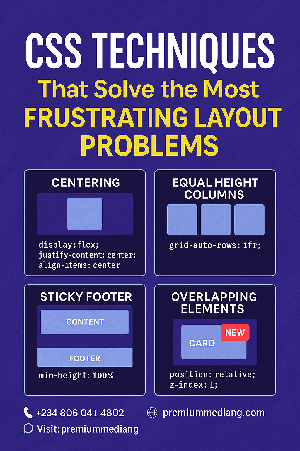

CSS Techniques That Solve the Most Frustrating Layout Problems
Modern web design demands flexible, responsive layouts that work across devices and browsers. Yet even seasoned developers hit roadblocks—unequal heights, centering nightmares, sticky footers that refuse to stick. In this guide, we’ll explore five powerful CSS techniques that tame the most exasperating layout challenges, helping you ship pixel‑perfect designs faster and with less hackery.
1. Vertical & Horizontal Centering with Flexbox
The Problem: Centering an element both vertically and horizontally within a container used to require absolute positioning, negative margins, or table hacks.
The Solution: A simple Flexbox wrapper.
.container {
  display: flex;
  justify-content: center; /* horizontal centering */
  align-items: center;     /* vertical centering */
  height: 100vh;           /* full viewport height */
}
<div class="container">
  <div class="modal">Centered Content</div>
</div>
- Why It Works: Flexbox’s axis‑based alignment means no more guesswork with margins.
- Browser Support: Excellent (IE11+ with
-ms-prefix).
2. Equal‑Height Columns with CSS Grid
The Problem: Columns of varying content length end up misaligned, breaking your card‑based or multi‑column layouts.
The Solution: A two‑row CSS Grid.
.grid {
  display: grid;
  grid-template-columns: repeat(3, 1fr);
  grid-auto-rows: 1fr; /* forces equal height rows */
  gap: 1rem;
}
.item {
  background: #f5f5f5;
  padding: 1rem;
}
<div class="grid">
  <div class="item">Short content</div>
  <div class="item">Much longer content that would normally stretch the column...</div>
  <div class="item">Medium content</div>
</div>
- Why It Works:
grid-auto-rows: 1frensures each row’s height matches the tallest cell. - Bonus: Easily extend to responsive layouts with
grid-template-columns: repeat(auto-fit, minmax(250px, 1fr));
3. Sticky Footers Without JavaScript
The Problem: Your footer floats up when content is short, leaving empty space below.
The Solution: A Flexbox page wrapper.
html, body {
  height: 100%;
  margin: 0;
}
.page-wrapper {
  display: flex;
  flex-direction: column;
  min-height: 100%;
}
.content {
  flex: 1; /* pushes footer to bottom */
}
footer {
  background: #222;
  color: #fff;
  padding: 1rem;
}
<div class="page-wrapper">
  <main class="content">
    <!-- page content -->
  </main>
  <footer>© 2025 Premium Media NG</footer>
</div>
- Why It Works: The
.contentarea expands to fill available space, forcing the footer down. - Pro Tip: Combine with
header { flex-shrink: 0; }to keep your header in place.
4. Responsive Media Aspect Ratios with the Padding Hack
The Problem: Embeds (videos, iframes) break your responsive grid by overflowing or squashing.
The Solution: The intrinsic ratio “padding‑hack.”
.media-wrapper {
  position: relative;
  width: 100%;
  /* 16:9 aspect ratio → 9/16 = 56.25% */
  padding-top: 56.25%;
  overflow: hidden;
}
.media-wrapper iframe,
.media-wrapper video {
  position: absolute;
  top: 0; left: 0;
  width: 100%;
  height: 100%;
}
<div class="media-wrapper">
  <iframe src="https://www.youtube.com/embed/xyz" frameborder="0"></iframe>
</div>
- Why It Works: The percentage padding on a parent sets proportional height based on its width.
- Use Cases: YouTube videos, Google Maps embeds, background videos.
5. Overlapping Elements with CSS Grid & z‑index
The Problem: You need decorative overlays (e.g., badges, ribbons) that overlap cards without ruining document flow.
The Solution: Place elements in the same grid cell.
.card-container {
  display: grid;
  position: relative;
}
.card {
  grid-area: 1 / 1; /* covers entire container */
  background: #fff;
  padding: 1.5rem;
  z-index: 1;
}
.badge {
  grid-area: 1 / 1;
  justify-self: end;
  align-self: start;
  background: #e63946;
  color: #fff;
  padding: 0.5rem 1rem;
  z-index: 2;
}
<div class="card-container">
  <div class="card">Product Details Here</div>
  <div class="badge">New</div>
</div>
- Why It Works: Grid layering lets you stack elements without extra wrappers or absolute positioning nightmares.
- Tip: Control stacking order cleanly with
z-indexin CSS.
Conclusion
By mastering these modern CSS techniques, you’ll eliminate the pain of layout hacks and focus on what really matters: crafting delightful user experiences that perform beautifully on any device. Whether you’re building landing pages, dashboards, or full‑scale web apps, these solutions will save hours of debugging and keep your stylesheets lean.
Ready to Level Up Your Front‑End?
At Premium Media NG, our expert team combines cutting‑edge CSS with UX best practices to deliver scalable, maintainable, and high‑performance web solutions.
📞 Let’s talk: +234 806 041 8202
🌍 Visit: premiummediang.com
📲 DM us: @premiummediang
Premium Media NG — Your partner for pixel‑perfect, future‑proof web development.
DigitalMarketingMastery #StorytellingWins #PremiumMediaNG #DigitalMarketing #DigitalAgency #MarketingInnovation #FutureOfMarketing #GrowthMarketing #UnlockYourGrowth #DigitalTransformation #MarketingExcellence #StrategicMarketing #YourDigitalPartner #GrowYourBrand #ROIMarketing #LeadGeneration #MoreLeadsMoreSales #ConversionOptimization #DataDrivenMarketing #MeasurableResults #DigitalSuccess #BoostYourBusiness
 Building Digital Excellence
Leave a comment