The Algorithm of Color: A Data-Backed Framework for Industry-Specific Branding
90% of a consumer’s initial assessment of a brand is based on color alone. (University of Winnipeg). Are you leaving that critical first impression to chance?
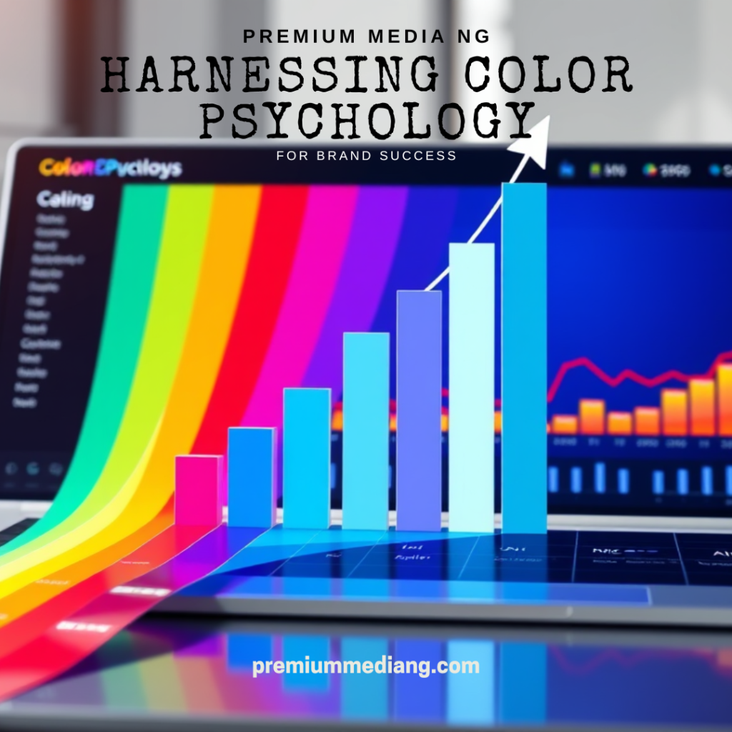
In the digital marketplace, your brand’s color palette is not a decorative element—it is a quantifiable business asset. It is a psychological algorithm that directly influences perception, trust, and most critically, conversion rates. At Premium Media NG, we engineer brand identities based on this precise principle. This article provides a data-backed framework for selecting a high-converting color palette tailored to your industry.
The Strategic Imperative of Color
Research from the Institute for Color Research confirms that color increases brand recognition by up to 80%. Furthermore, a KISSmetrics study found that 85% of shoppers cite color as the primary reason for buying a product. The evidence is unequivocal: the correct application of color psychology is not a matter of taste; it is a strategic imperative for market success.
The Industry-Specific Color Matrix: A Data-Driven Guide
The “one size fits all” approach is a recipe for brand mediocrity. The following matrix details the optimal color strategies for five key sectors, based on aggregated psychological and market data.
| Industry | Primary Strategic Goal | Data-Backed Color Palette | Psychological Rationale & Measurable Impact |
|---|---|---|---|
| Food & Beverage | Stimulate Appetite & Impulse | Reds, Oranges, Warm Yellows | Red triggers a primal response, raising heart rate and appetite (e.g., KFC, Coca-Cola). Orange/Yellow project warmth, value, and happiness. Studies show these warm tones can create a sense of urgency, ideal for impulse purchases. |
| Fashion & Retail | Convey Identity & Premium Value | Black, White, Metallics, Bold Accents | Black is synonymous with sophistication, power, and luxury (e.g., Chanel). Metallics (Gold/Silver) can increase perceived product value by up to 30%. Bold accents (Fuchsia, Electric Blue) attract attention and signal innovation. |
| Tech & Telecommunications | Build Trust & Communicate Innovation | Blues, Greens, Modern Neutrals | Blue is overwhelmingly associated with trust, security, and dependability—a non-negotiable for data-driven services (Facebook, LinkedIn, IBM). Green signifies growth, harmony, and forward-thinking, ideal for fintech and SaaS. |
| Engineering & Industrial | Project Reliability & Precision | Deep Blues, Dark Greens, Charcoal Grey | Dark Blue & Charcoal Grey communicate professionalism, stability, and strength. These colors are proven to evoke a sense of logic and calm authority. An Orange accent can be strategically used for CTAs, symbolizing precision and action. |
| Hospitality & Hotels | Evoke Comfort & Trust | Earth Tones, Navy Blue, Cream, Soft Greens | Beige, Cream, and Brown psychologically trigger feelings of comfort, relaxation, and warmth—making guests feel “at home.” Navy Blue introduces a layer of professional reliability. These palettes are designed to lower anxiety and promote dwell time. |
The Strategic Implementation Flowchart
Selecting the palette is only the first input into the algorithm. Its effective deployment across all customer touchpoints is what generates ROI. Our proprietary framework at Premium Media NG follows this exact flow:
1. ANALYZE: (Market, Competitors, Target Audience Psychology)
2. DEFINE: (Primary, Secondary, & Accent Palette based on Matrix above)
3. APPLY: (Implement systematically across all assets)
- Digital Core: Logo & Website UI (Primary color for CTAs can boost conversions by over 35% according to HubSpot).
- Marketing Engine: Social Media, Digital Ads, Email Campaigns.
- Physical Experience: Office Space, Uniforms, Packaging.
4. OPTIMIZE: (A/B test colors on key landing pages and ads to refine performance).
The High Cost of Chromatic Guesswork
An amateurish or misaligned color scheme is a silent revenue leak. It can:
- Confuse your value proposition, leading to higher bounce rates.
- Erode trust before a word is read, damaging credibility.
- Render expensive marketing campaigns ineffective, yielding a poor ROAS (Return on Ad Spend).
Engineer Your Brand’s Success with Data, Not Guesswork
At Premium Media NG, we replace aesthetic guesswork with a strategic, engineering-minded approach to branding. Our process integrates the color psychology framework you’ve just read with our full-stack digital expertise. We don’t just design a logo; we build a cohesive, high-converting visual system that includes:
- Data-Backed Brand Strategy & Color Palette Development
- High-Impact Logo & Visual Identity Design
- Conversion-Focused Website & UI/UX Design
- Digital Marketing Campaigns Powered by Brand Psychology
We ensure your brand’s first impression is a calculated one, designed to attract, engage, and convert your ideal customers from the very first glance.
Your brand’s color algorithm is currently calculating. Is it optimizing for growth or for obscurity?
Move from subjective opinion to objective strategy.
📞 Schedule Your Data-Driven Brand Consultation: +234 806 041 8202
🌍 Analyze Our Expert Case Studies: premiummediang.com
📲 DM @premiummediang for a Free Brand Color & Conversion Audit

Leave a comment